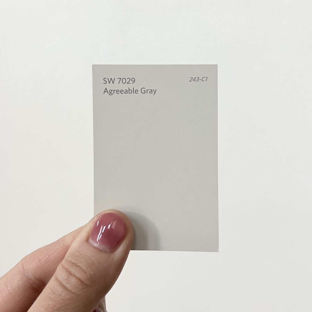
Are you looking for a beautiful neutral paint color to add in your home? If so, you’ve probably come across Agreeable Gray by Sherwin Williams. It’s one of the most popular neutral paint colors! It was actually the main color for the walls at our first house, the California Cottage. Today I want to share with you my paint color review for Agreeable Gray Sherwin Williams to help you decide if it’s the right color for your home!
Note: This post may contain affiliate links, you can find more information in my disclosures here.
What does Sherwin Williams Agreeable Gray look like?
Sherwin Agreeable Gray is a gray paint color that is neutral and warm. It has undertones of beige and is sometimes described as a greige. It’s the perfect choice if you want a neutral color that is versatile, works in many different spaces and looks beautiful in all paint sheens. It’s a popular choice for good reasons!
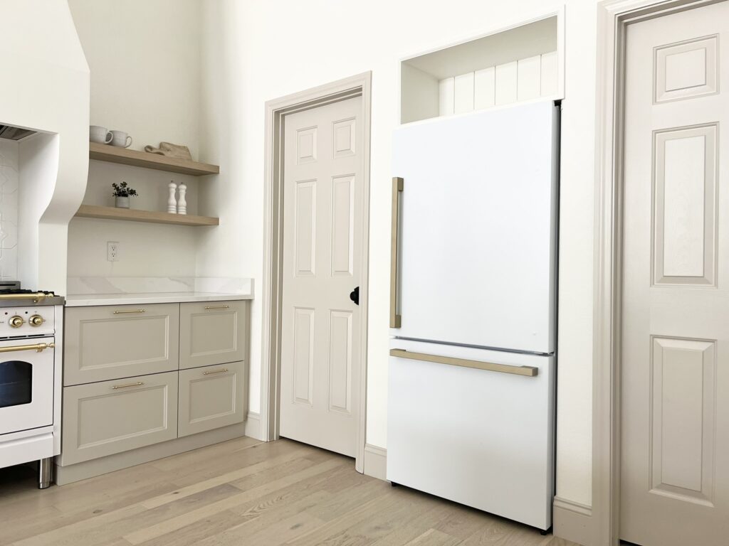
We used Agreeable Gray paint in all the main living areas at the California Cottage. Here is an example of SW Agreeable Gray walls in our living room paired with Extra White baseboards and a Pure White barndoor in our home:
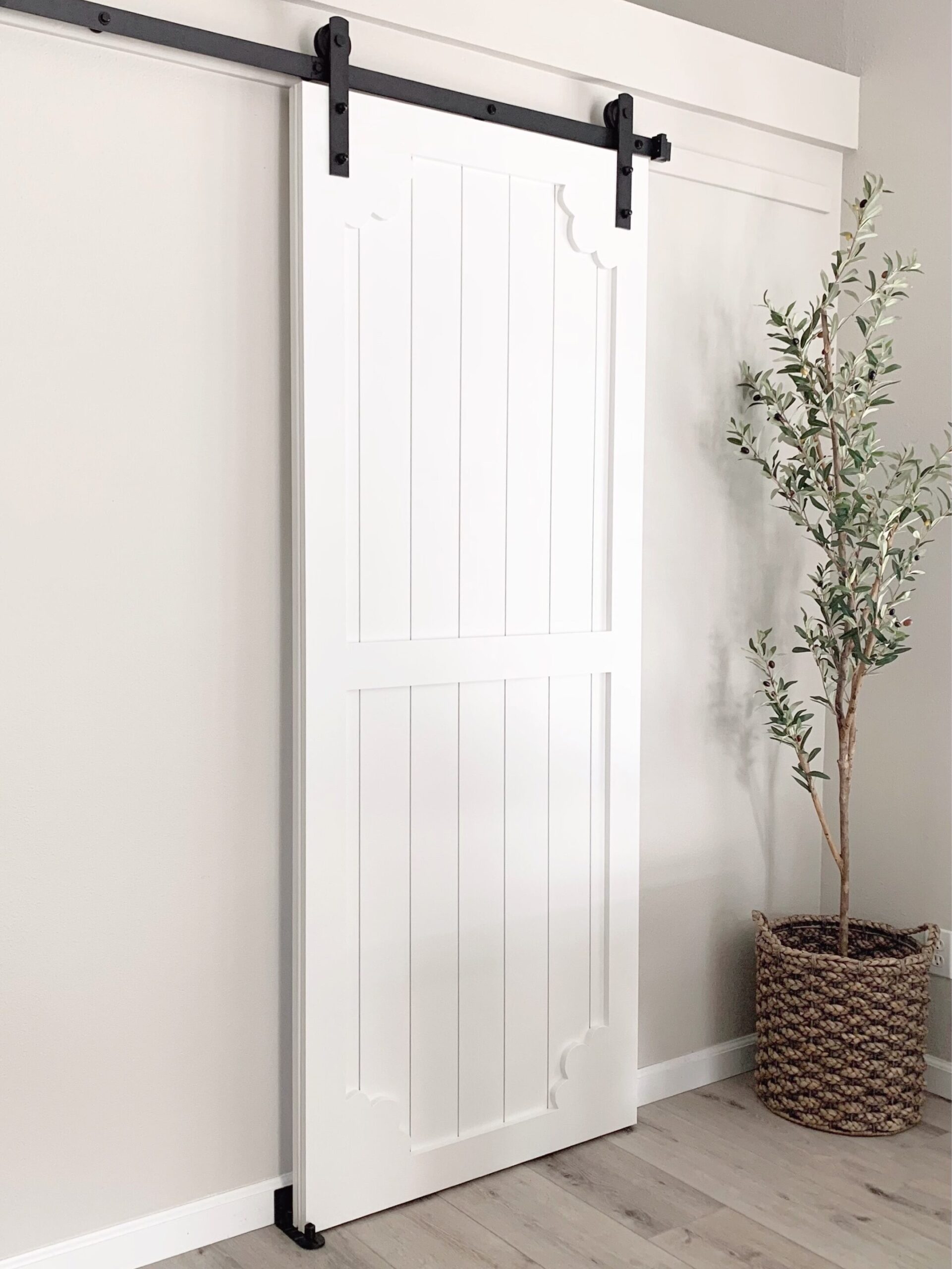
The living room here is a south-west facing room. The wall in this picture is directly facing outside so the wall itself is also south-west facing.
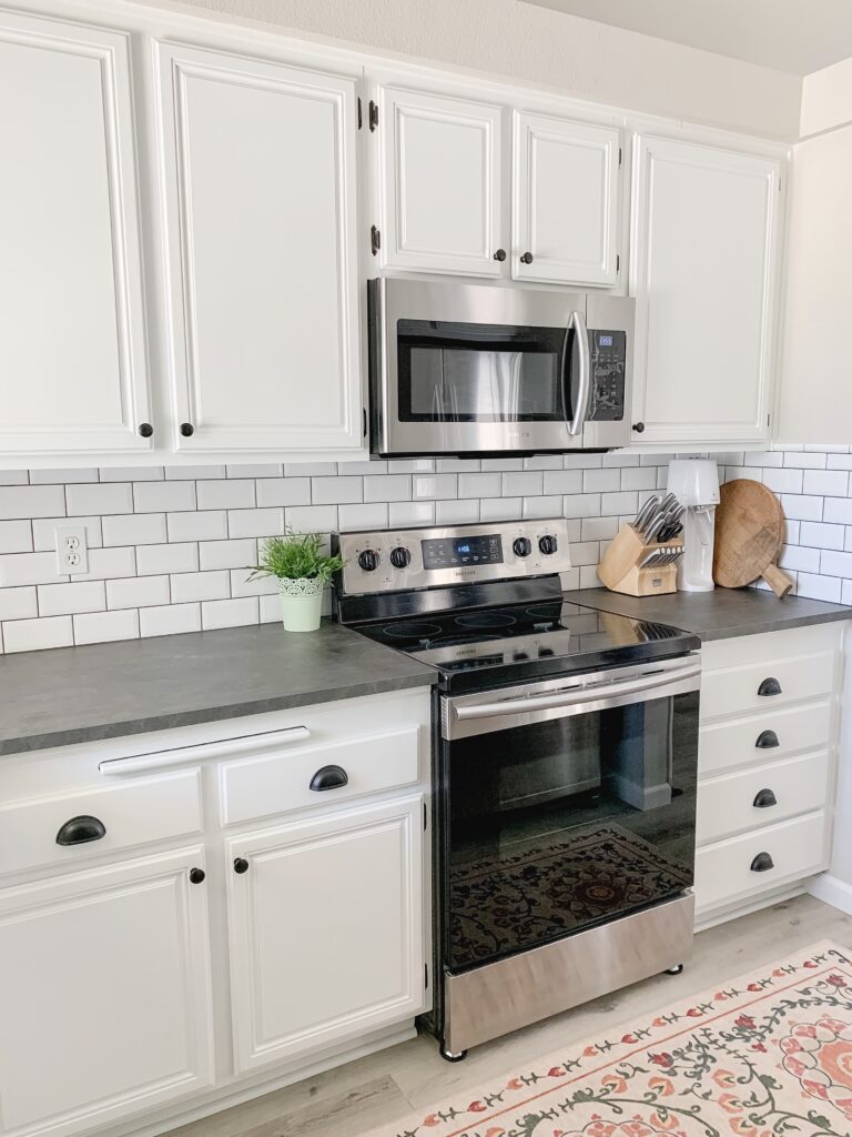
Below is a picture of Sherwin Williams Agreeable Gray with white kitchen cabinets. I used Sherwin Williams Pure White for the cabinets. I think Pure White pairs really well with Agreeable Gray Sherwin Williams!
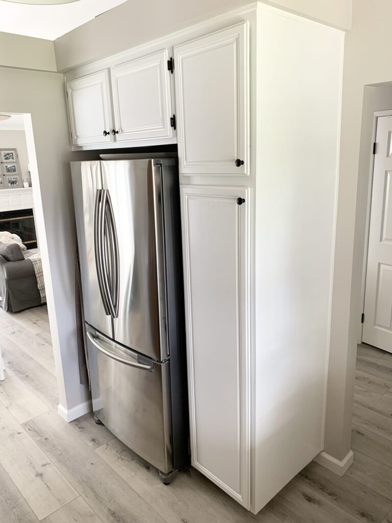
You can see how the tone of Agreeable Gray changes depending on the natural light and the shadows!
The right side has more sunlight and Agreeable Gray looks more beige and like a warm gray. On the left side, that is slightly darker with less sunlight, it looks more like a true gray. For refence the kitchen here is facing north-east.
Here is Agreeable Gray by Sherwin Williams in our home in different settings, you can really see the wide range in its appearance depending on the light and time of day:
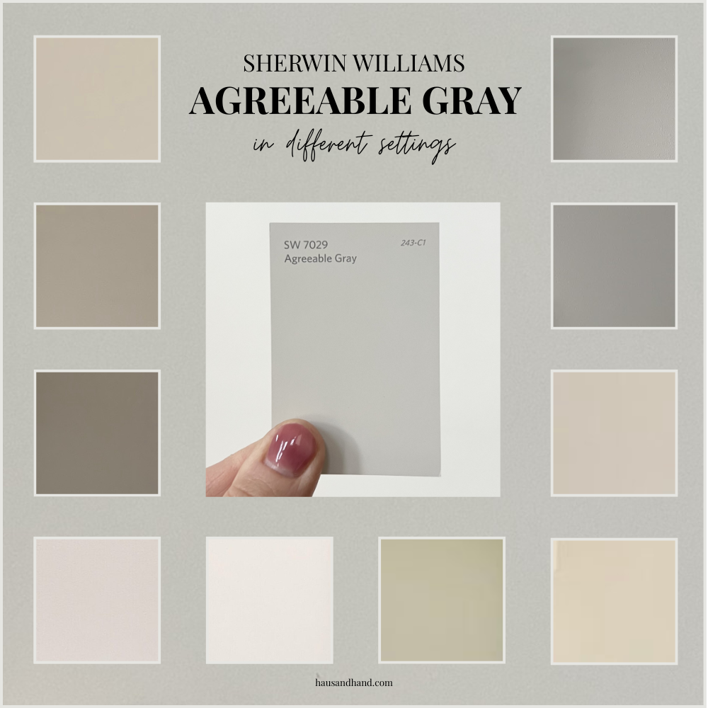
In some of these, Agreeable Gray looks gray, but more beige or even light brown in others. Some of our photos even show it looking a little green or yellow. This is why it’s so important to sample a color in your space before committing to painting a whole wall or even an entire house! I have a tip for you below on how you can sample any wall color the easy way.
I’ll also share more about my personal experience with the undertones that Agreeable Gray by Sherwin Williams has further down below!
Why is Agreeable Gray so popular?
Sherwin Williams Agreeable Gray is one of the most popular colors because its a beautiful neutral color. Greige colors have been a popular choice, especially for walls and kitchen cabinets over the last few years. Agreeable Gray is a pretty neutral shade of gray with nice undertones. This greige paint color looks beautiful in a variety of paint sheens. That makes it perfect for a lot of different spaces and applications!
What is the LRV of SW Agreeable Gray?
The Light Reflectance Value (LRV) of SW Agreeable Gray is 60. LRV measures the percentage of light a paint color reflects. It’s measured on a scale from zero (absolute black, absorbing all light and heat) to one hundred (pure white, reflecting all light). This means that Agreeable Gray by Sherwin Williams is on the lighter side but much darker than white.
What undertones does Sherwin Williams Agreeable Gray have?
Sherwin William Agreeable Gray is a unique greige that can show a wide range of different colors in its undertones depending on the setting. This can make Agreeable Gray tricky to pair with other colors.
Sherwin Williams Agreeable Gray undertones were cool and showed hints of violet, green and blue in our home depending on the light.
However, one of our friends painted his interior Agreeable Gray Sherwin Williams and the undertones at his house were warmer and leaning more yellow and green.
Agreeable Gray by Sherwin Williams is a beautiful neutral but it can look very different in different spaces. I recommend picking up a paint sample to test it our in your space and to avoid any unexpected and disappointing results.
Accessible Beige versus Agreeable Gray
Sherwin Williams Agreeable Gray is kind of like a sister to Sherwin Williams Accessible Beige which is a beige paint color that is neutral and warm but has undertones of gray. Accessible Beige is another popular paint color in the greige family. It’s pretty much the opposite of Agreeable Gray but similar.
Accessible Beige leans more toward the warmer side of the color spectrum due to its beige undertones. It’s a great choice for a more transitional look.
We used Sherwin Williams Accessible Beige in a satin sheen for the kitchen cabinets and in a semi-gloss sheen as a trim color on the baseboards and doors at the Hills House:
This paint color looks great in all sheens and I really love how well it coordinates with wood and specifically with white oak!
Repose Gray versus Agreeable Gray
Repose Gray is another greige color that is often compared to Agreeable Gray. The LRV of Repose Gray by Sherwin Williams is 58. That makes Repose Gray a little darker than Agreeable Gray. It’s also a little less beige in comparison. Repose Gray would be a great choice if you’re looking for a color that is closer to a true gray than Agreeable Gray.
Revere Pewter versus Agreeable Gray
If you’re wondering “what is the Benjamin Moore equivalent to Agreeable Gray?” some people might answer that it’s Revere Pewter! However, Revere Pewter by Benjamin Moore has an LRV of 55, so it’s a bit darker. Revere Pewter has similar undertones as Agreeable Gray with a little more green in the background.
Fun fact about Benjamin Moore Revere Pewter: Christina from Flip or Flop said they “use this in 90 percent of our flips - for every room. It makes furniture look great, and buyers love it.” So if you’re looking for a tried and true neutral color, Revere Pewter might be another great option!
What colors compliment Sherwin Williams Agreeable Gray?
As far as deciding what goes with Sherwin Williams Agreeable Gray, I’ve combined it with Sherwin Williams Pure White in our kitchen:
I’ve also combined this gray paint color with baseboards, trim and doors that were Sherwin Williams Extra White:
When I was deciding on the color scheme for the California Cottage, I considered Sherwin Alabaster baseboards with Agreeable Gray walls but found that Alabaster was too warm and not contrasting enough.
On the Sherwin Williams website, they also share what colors match Sherwin Williams Agreeable Gray:
- Incredible White SW 7028 (though I haven’t combined this with Agreeable Gray, I did use Incredible White in the primary bathroom alongside Pure White)
- Extra White SW 7006 (that I mentioned above from personal experience)
- Coral Rose SW 9004
Tips for choosing the best paint color
I really like to take recommendations for paint colors from professional designers. There are many colors that are popular and used frequently by interior designers for good reason! Over time, they’ve proven to look beautiful in lots of different spaces.
In most cases, there is no need for me to reinvent the wheel and I like to use those popular colors as a starting point. From there, I narrow down my search by looking at the paint swatches. I will typically take home 2-3 color samples to see how the colors are going to look in different lighting situations in my own home.
I recommend painting a large cardboard and moving it around to see what the color looks like in different lighting:

That’s what I did for the California Cottage exterior paint and we ended up loving our Sherwin Williams Oyster Bay exterior!
I hope you found this paint color review of Sherwin Williams Agreeable Gray helpful! Do you have a favorite neutral paint color that you’ve used and love? Let me know in the comments!
As always, feel free to reach out with any questions.
Tina
Leave a Reply