Are you looking for the best green paint colors? Look no further! I’ve scoured the internet for the most popular green paint options to find the perfect green for our living room makeover at the new house. I’m so excited to share 9 beautiful shades of green along with real-life examples of them in this post!
Note: This post may contain affiliate links, you can find more information in my disclosures here.
What is the most popular shade of green?
After doing some research, I’ve created a list of the 9 most popular shades of green based on the amount of internet searches for them.
Without further ado, here are some of the most searched for green paint colors:
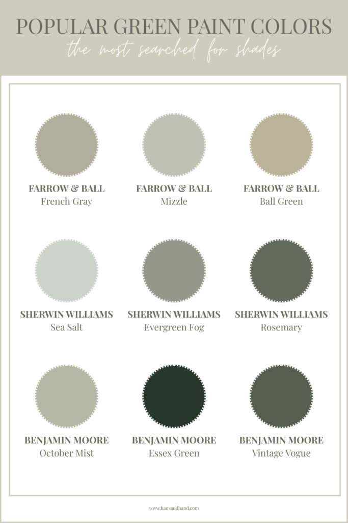
Now, let’s get into the details of each of these green paint colors and let’s also take a look at some beautiful real-life pictures of them:
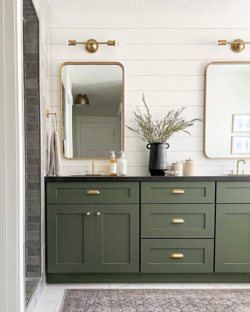
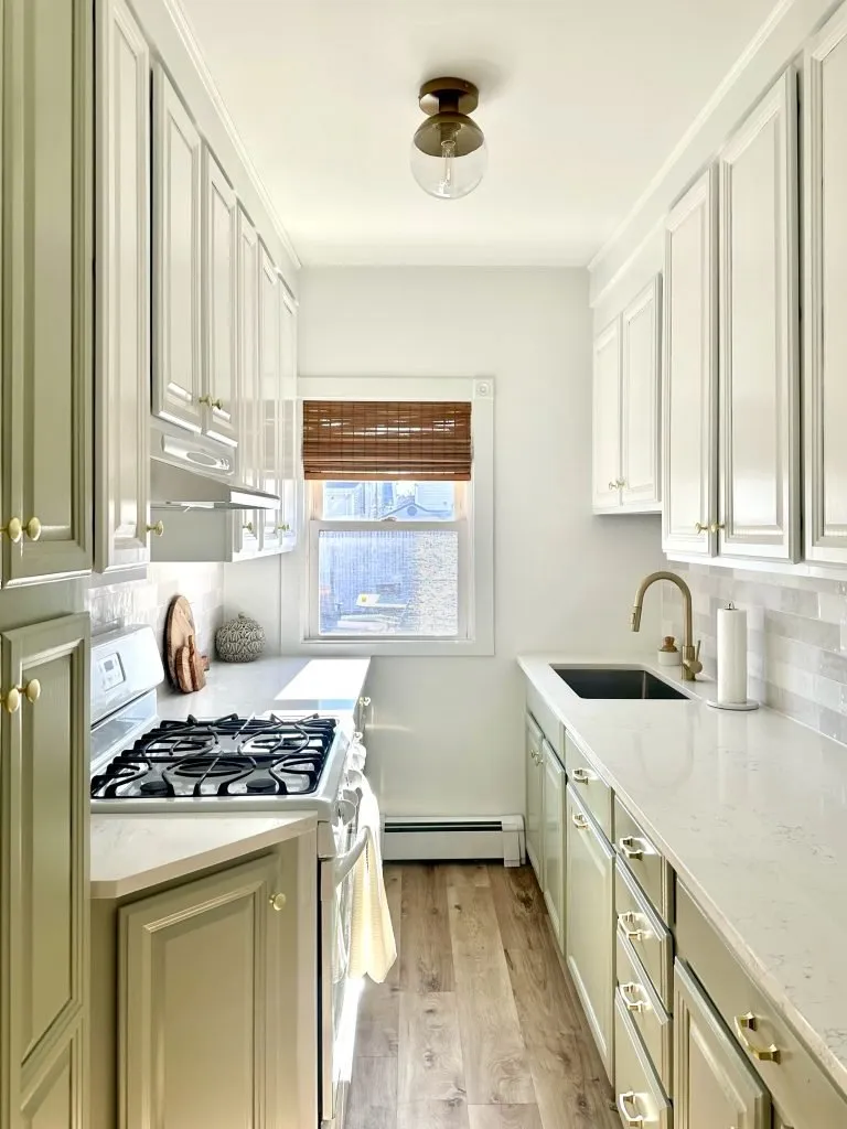
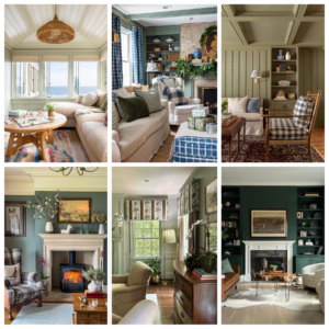
French Gray by Farrow & Ball
French Gray by Farrow & Ball is really more of a green than a grey, but changes its appearance depending on the light and time of day.
This French Gray kitchen stopped me in my tracks! I think all the details here like the shiplap wall, the gold hardware throughout, the countertops and the floors are so beautiful and perfectly complement the French Gray:

I think French Gray is one of those green shades that would work well in lots of different rooms like kitchens, living rooms, and dining rooms.
Mizzle by Farrow & Ball
Mizzle by Farrow & Ball is a grey green color and is considered a lighter shade of Pigeon and Blue Gray by Farrow & Ball.
I love the way Mizzle looks in the space below and I think it’s the perfect color to pair with ornate white trim:
Here is another example of Mizzle by Farrow & Ball with lots of natural light. The custom cabinetry is so beautiful and the color pairs perfectly with the wood:
Ball Green by Farrow & Ball
Ball Green by Farrow & Ball is a muted green.
Doesn’t the Ball Green front door in this picture complement the brick on the exterior perfectly?

I could see this color also pairing well with darker brown exterior stains!
Sea Salt by Sherwin Williams
Sea Salt by Sherwin Williams is a cool, muted green with blue undertones and perfect for beachy spaces. It pairs nicely with wood accents and white trim.
I love how this bedroom turned out with the Sea Salt accent wall behind the headboard!

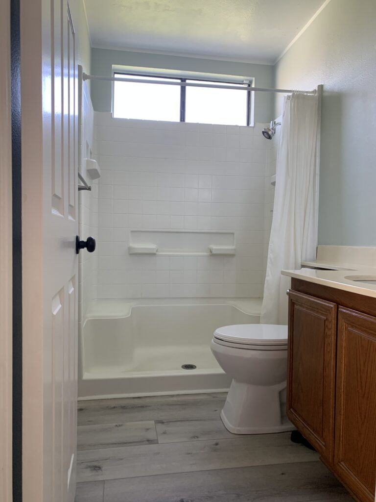
Fun fact: Our primary bathroom at the California Cottage was painted Sea Salt before we remodeled it!
Evergreen Fog by Sherwin Williams
Evergreen Fog by Sherwin Williams is somewhat of a chameleon color. It’s a combination of green and gray with just a touch of blue.
This color drenched pantry looks so beautiful with the cabinets, walls and trim all painted Evergreen Fog! I really love the combination of this paint color with the polished hardware, white countertop, and checkered floors:
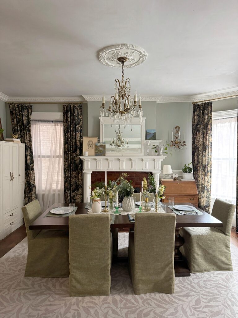
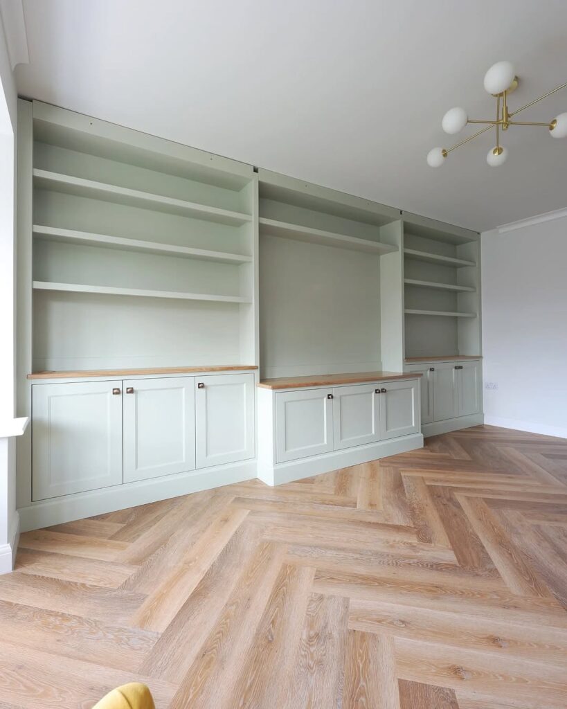
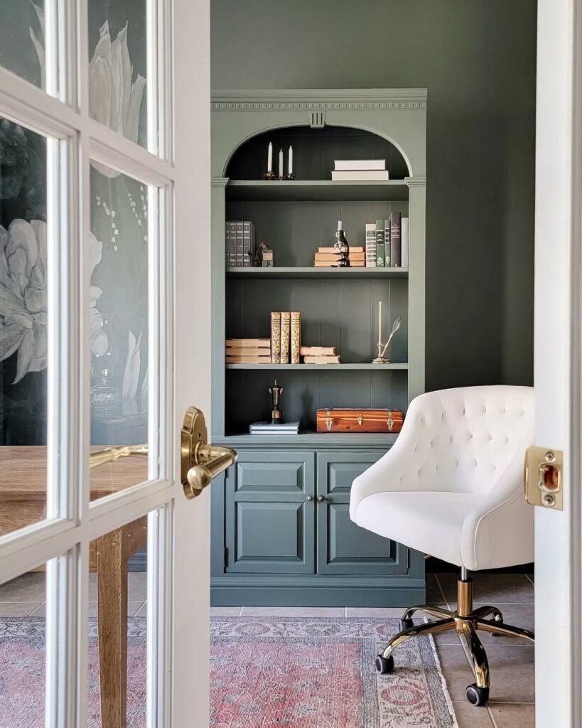
Rosemary by Sherwin Williams
Rosemary by Sherwin Williams is a deep green with a cool gray undertone.
Take a look at the beautiful combination of Rosemary with white, gold and dark gray here:
Here’s another example of Rosemary. Don’t these built-ins look so beautiful with the gold accents and the wood desk?

These two examples of Rosemary show how different this color can look in different spaces with different lighting. This is a good reminder to sample your favorite colors in your own space to make sure you like the way a color looks in your home!
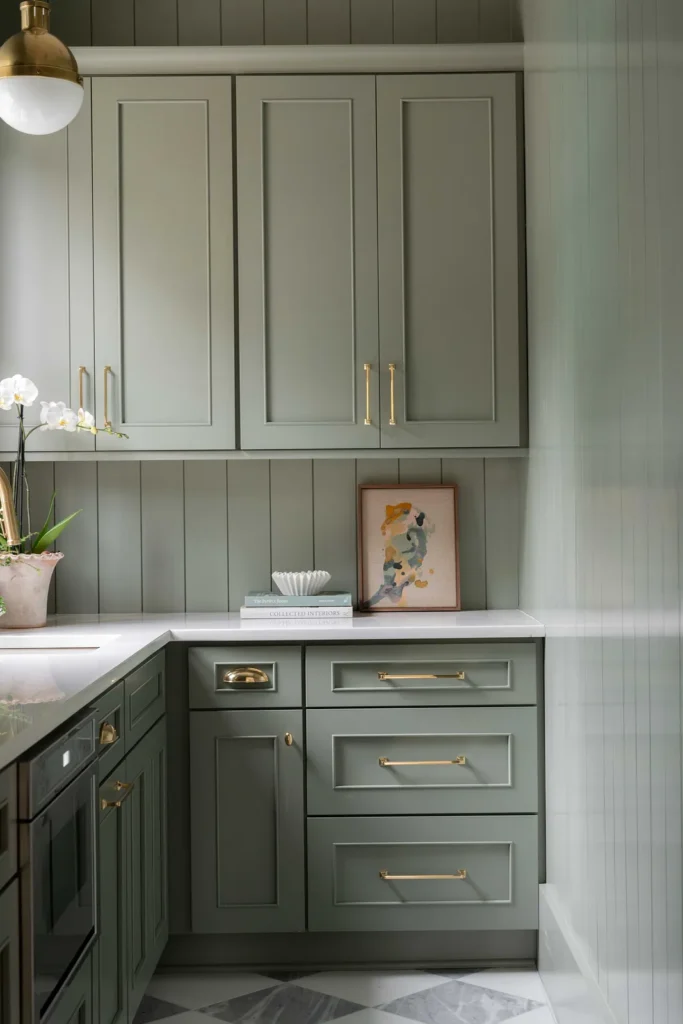
October Mist by Benjamin Moore
October Mist by Benjamin Moore is a beautiful sage color.
I’ve seen October Mist being used as a cabinet color a few times before and love the way it looks in this kitchen!
Essex Green by Benjamin Moore
Essex Green by Benjamin Moore is a nearly black shade of green with a historic feel.
The bar below with Essex Green cabinets looks amazing! I think this dark green pairs so well with the gold accents throughout this space:

Vintage Vogue by Benjamin Moore
Vintage Vogue by Benjamin Moore is a dark green shade that can be used in the place of black or dark brown.
I think Vintage Vogue looks so beautiful in the space below and really highlights some of the more detailed woodwork:
That’s a wrap, I hope you enjoyed seeing some real-life examples of these popular green paint colors for some inspiration!
What shade of green makes a room look bigger?
Generally speaking, a paint color with a Light Reflective Value (LRV) of 60 or higher will help brighten up a space and can make it appear bigger. LRV quantifies the percentage of light a paint color reflects (0 being black and not reflecting any light, 100 being pure white and reflecting all light).
Of the popular greens I’ve shared above, Sea Salt by Sherwin Williams at an LRV of 64 is the most likely to make a room look bigger.
I used Sherwin Williams Sea Salt at the California Cottage in the primary bathroom when we first moved in before our primary bathroom remodel and it definitely made this relatively small bathroom appear bigger:
What green paint colors I’m considering for our living room
I’m so excited for our living room makeover but I also feel intimidated by all the green color options out there! For my own living room makeover, I’m going for a charming and cozy look. I’ll be looking for a lighter green that pairs well with Alabaster by Sherwin Williams to match our trim and kitchen cabinets.
So far, I plan on sampling the following interior paint colors:
- French Gray by Farrow & Ball
- Mizzle by Farrow & Ball
- Eddy by Farrow & Ball
- Light Blue by Farrow & Ball (which is supposed to be more of a blue green)
- Outrigger by Sherwin Williams
- Oyster Bay by Sherwin Williams
I would also like to add some matching wallpaper in a little reading nook project I have planned for our living room.
Stay tuned!
Tina
Leave a Reply